WORN AGAIN
Celebrating the power of personal style through the lens of circularity.
Customers were invited to take stock of what they already own and sculpt lasting fashion identities by turning personal collections into fashion playgrounds.
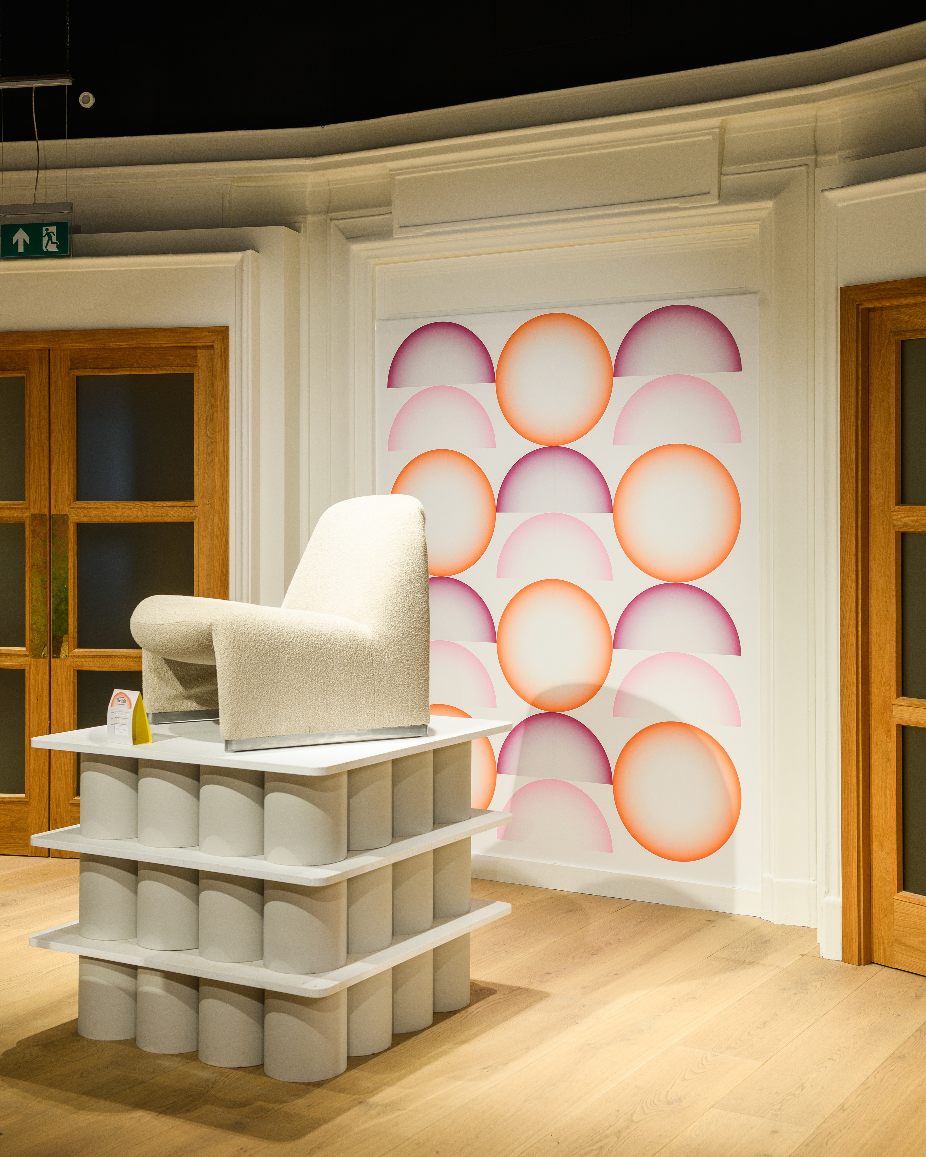
Just as the campaign focused on circularity, the Worn Again identity looked at the similar round symbolism, complete and incomplete, that became patterns when put together. The gradient created a softer texture over hard and blocky base colours, giving additional detail and contrast when applied to various applications.


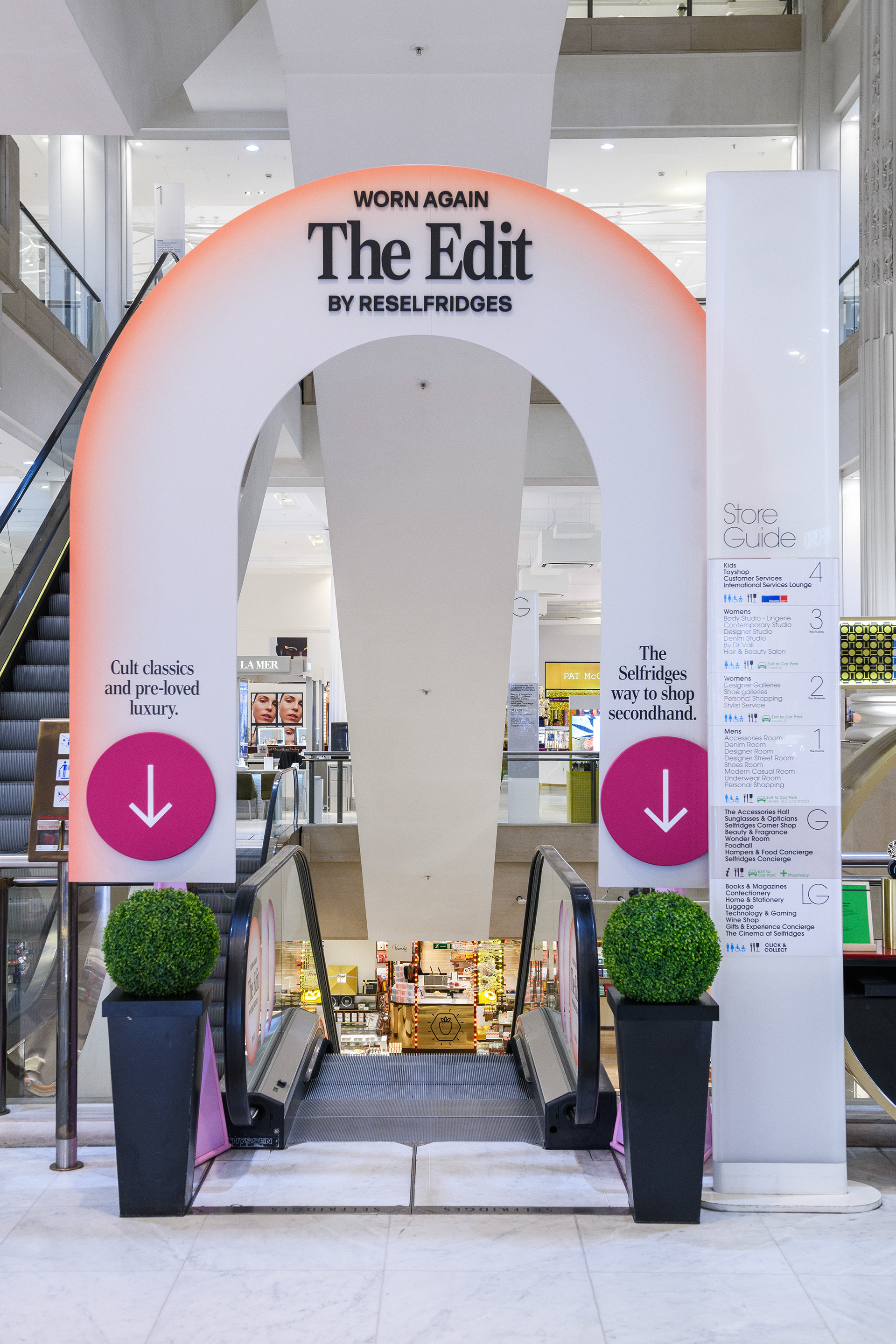
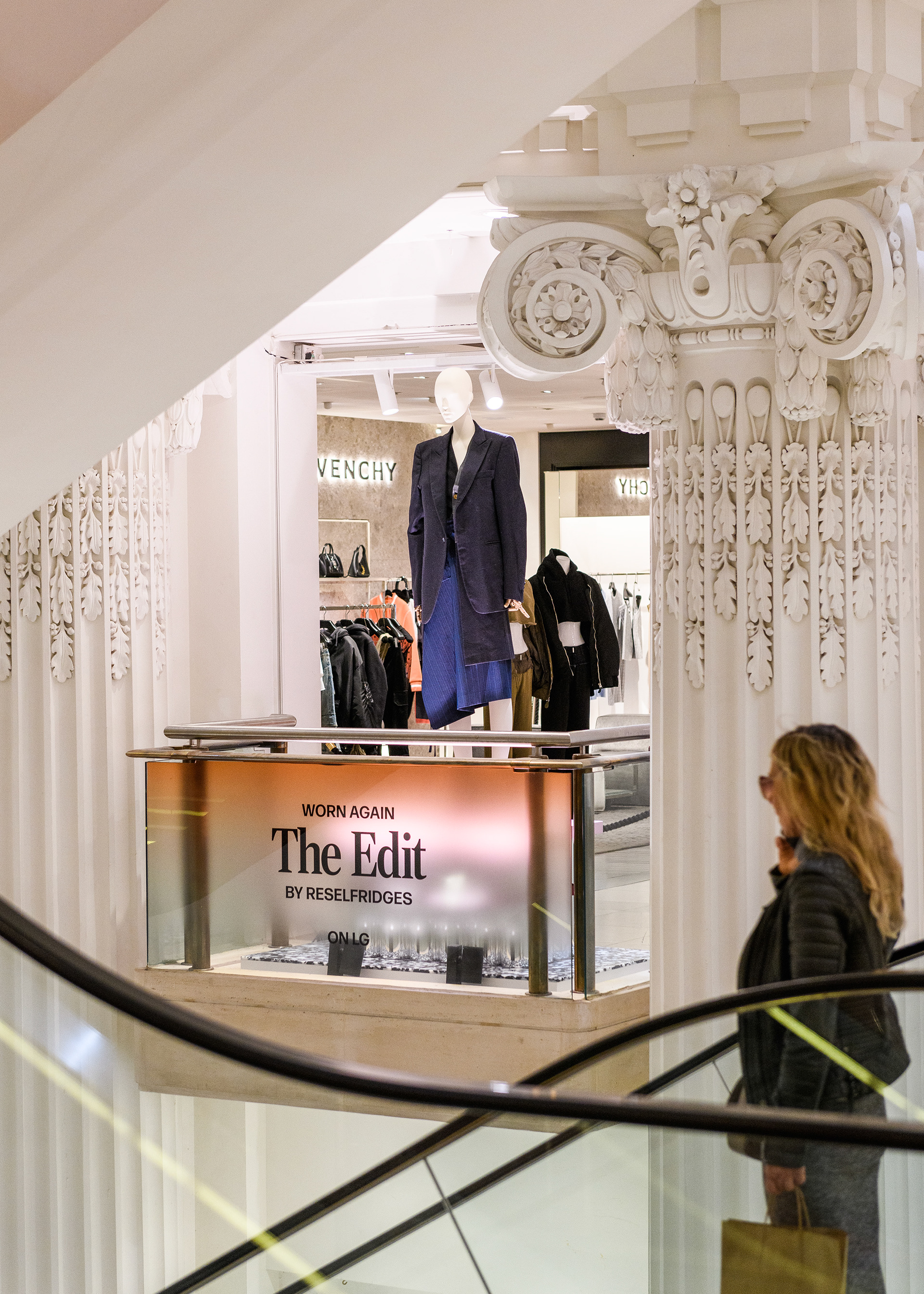
The Edit by Reselfridges
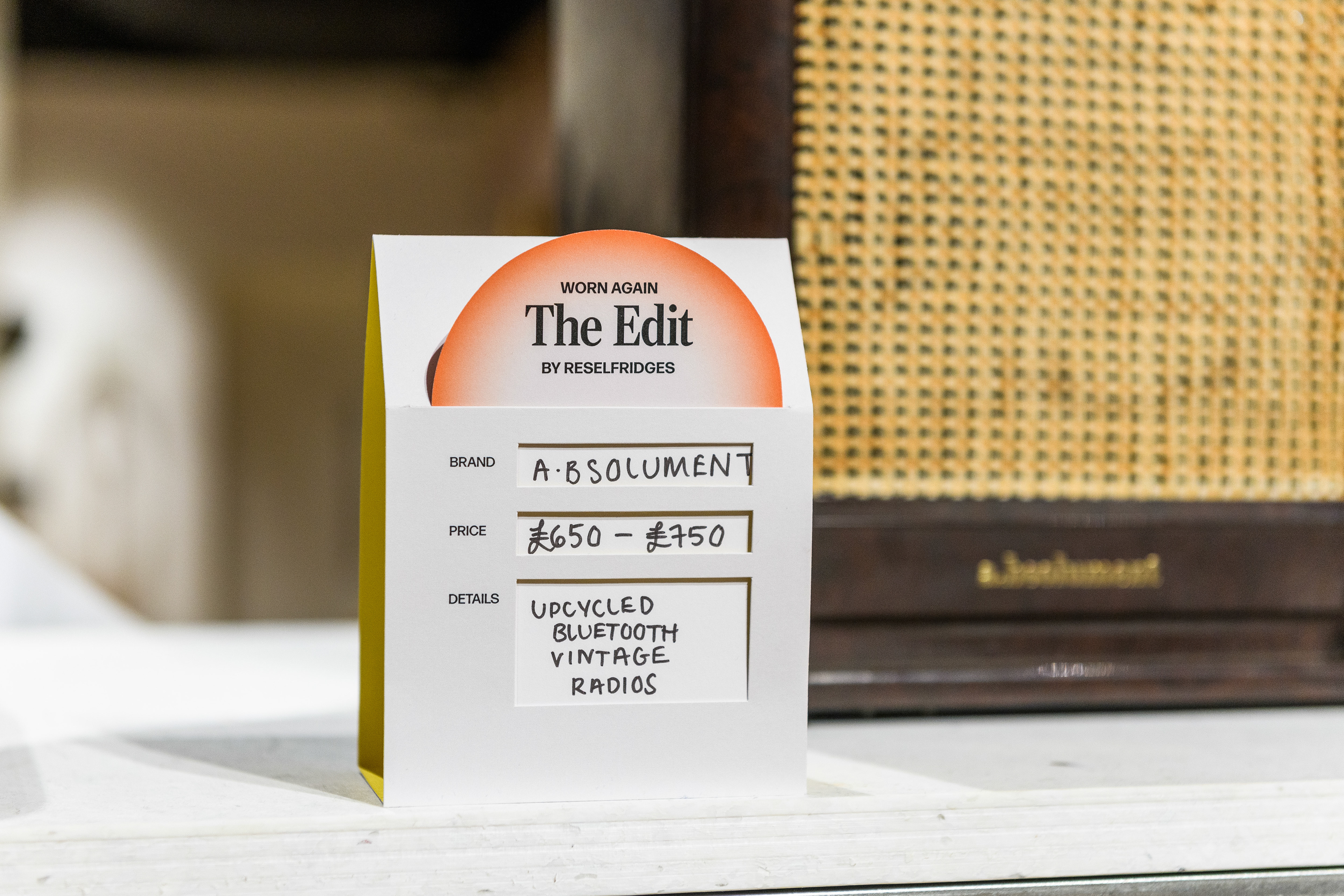
The fashion and lifestyle destination offered a new way to shop secondhand, with a focus on unique curation, environment and expert service. Designed with Liverpool-based architects, Mutt, we layered in warm gradients and patterns as graphic panels, fabric headers and ticketing.


- WIP -
Early identity development
